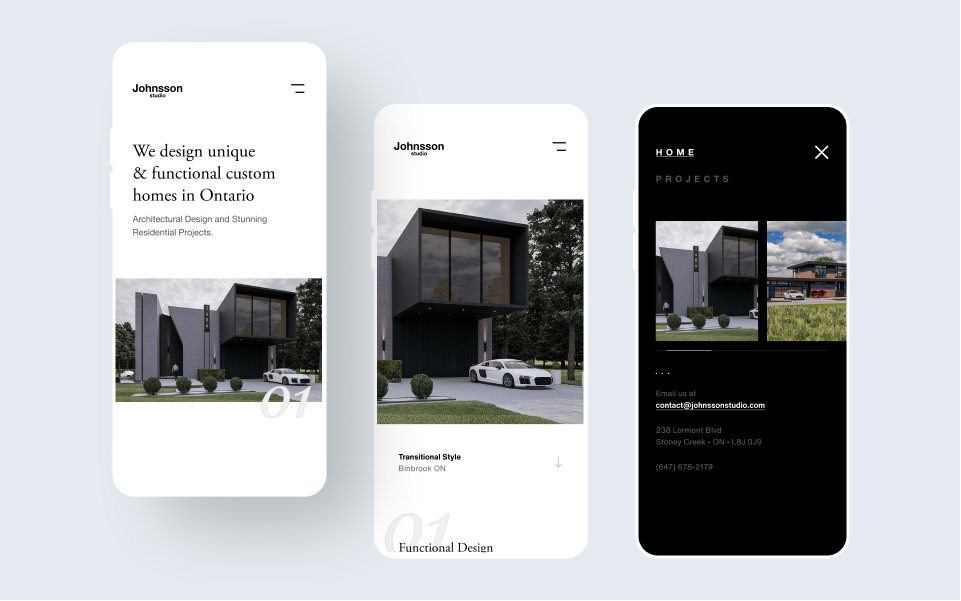
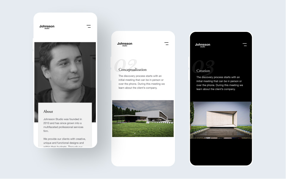
To start the process, we conducted a comprehensive analysis of the studio's existing website, identified its shortcomings, and conducted research to better understand their target audience's needs and preferences. From there, we developed a clear and concise user journey and created a new information architecture that organized their portfolio of work and services more effectively. We also worked with the studio's team to develop a new brand identity that better reflected their vision and values.
Problem
Improving the Online Presence for Johnsson Studio.
Johnsson Studio approached us with the challenge of redesigning their website to improve their online presence and better showcase their work. The existing website was outdated, difficult to navigate, and didn't effectively communicate the studio's expertise and capabilities. Our task was to create a modern, user-friendly, and visually appealing website that accurately reflected the studio's brand and showcased their portfolio of work.
Process
A customer focused website.
Solution
A Stunning Website that Showcases Johnsson Studio's Expertise.
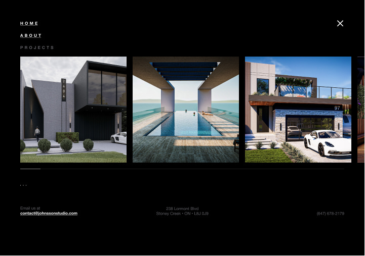
In the end, our redesign efforts resulted in a stunning new website that effectively showcased the studio's portfolio of work and expertise. The site's clean and modern design, combined with intuitive navigation and user-friendly features, improved the user experience significantly. The site's new brand identity also helped the studio to better stand out in a crowded market, and the site's increased visibility helped them to attract new clients and secure new business. Overall, the redesign project was a success, demonstrating the power of user-centric design and effective collaboration to deliver a high-quality UX solution that meets both the client's and user's needs.


